


Make your own ‘Publication’
Space and Story Micro-lesson and Sketchbook Project

Micro lesson: Space and Story
I’ve thought of this exercise for over a year, and I’m only finally doing it now.
Here's the idea: we fill our pages with text, by throwing it down in a collage style.
It's not about what the words say; they're just there to carve out the nooks and crannies for our art. This is where the fun begins—those spaces? That's where you unleash your creativity.
But why, you ask?
To get that gut feeling for space, for design.

You know how we learn to talk? By babbling away until it makes sense. That's the vibe here. We're playing around with text and art, learning the language of design by doing, seeing what works, what feels right.
Here's What We're Learning:
Spatial Sensitivity: Navigate text and image balance, experience creating compositions. This tightrope walk trains how you fit illustrations within broader designs.
Narrative Fusion: The text-illustration combo tells stories greater than the sum of it’s parts. It encourages illustrations that echo, contrast, or build upon the text, deepening narrative engagement.
Innovation: Limited spaces foster out-of-the-box thinking. This necessity to adapt can lead you to fresh techniques and perspectives.
Flexibility: Adapting to constraints is vital in professional scenarios. This exercise sharpens your ability to mould creativity to fit specific needs.
So, let's get to it. Grab that sketchbook, and let's turn those pages into a conversation between text and illustration. It's a way to see, really see, how design dances with space. And who knows? You might just surprise yourself with what you come up with.
Sketchbook Project: Space and Story
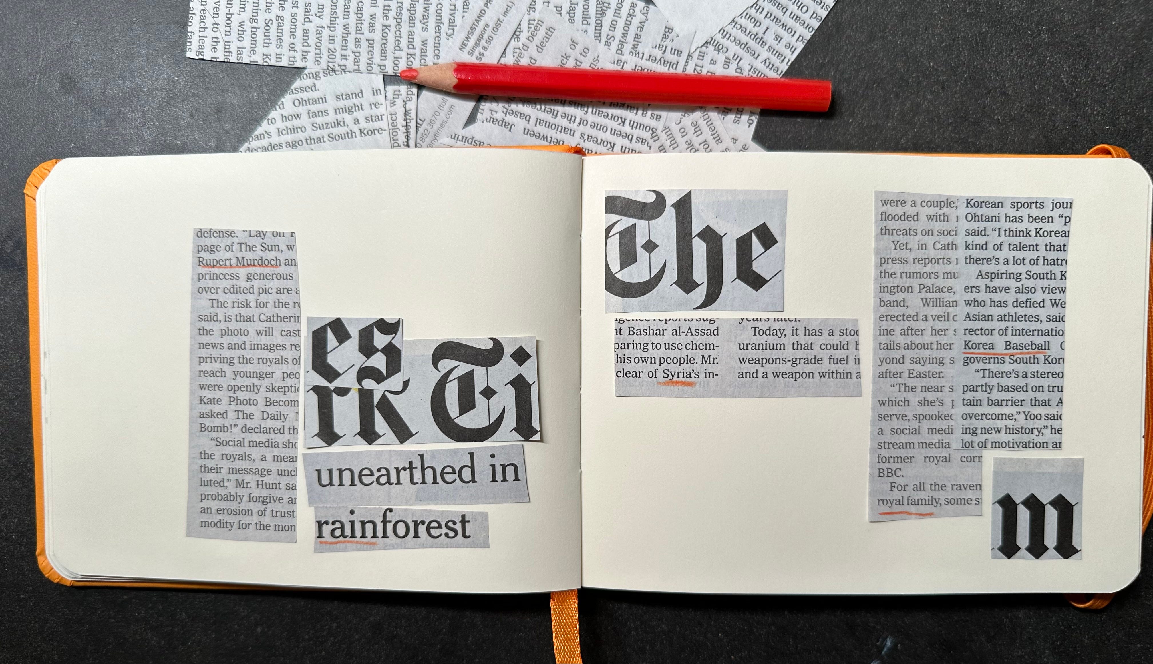
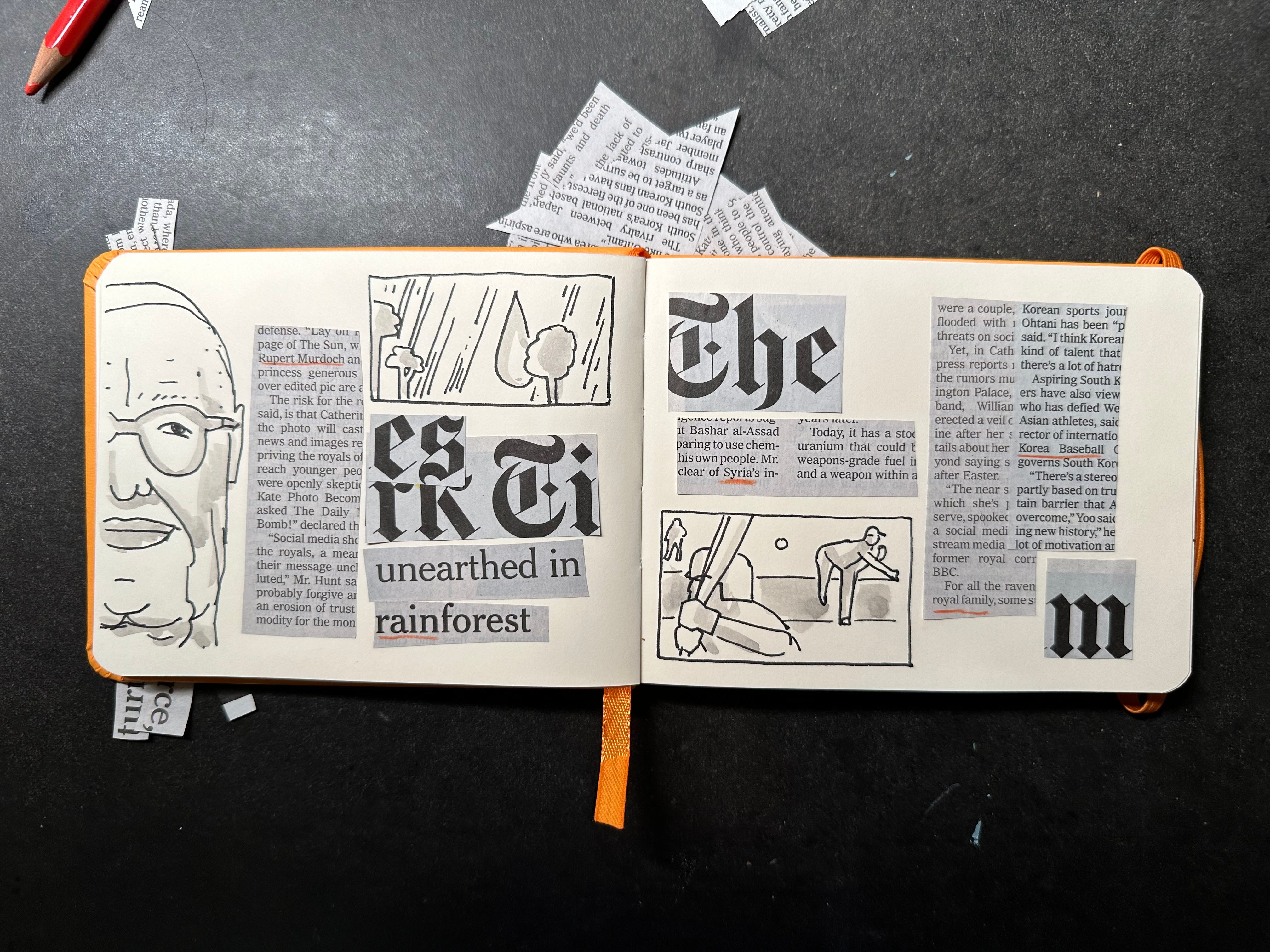
Text as Terrain: Begin by filling the pages of your sketchbook with text cut from magazines, newspapers, and other printed materials. The text should be arranged in a collage format, varying in size, font, and orientation. The aim is to create a visually interesting "terrain" of text, leaving deliberate spaces for illustrations. These spaces can range in size and shape, offering unique challenges and opportunities for visual storytelling.

Illustrative Response: Within the spaces left amongst the text, create illustrations that either complement or contrast with the surrounding text. The choice of subject matter for the illustrations is open to your interpretation, encouraging creativity and personal expression. The illustrations should be thoughtfully integrated, considering the flow of space and the interaction between text and image

.
Narrative Exploration: While the text serves primarily as a visual element rather than a narrative one, you are encouraged to let the text influence your illustrations in subtle ways. This could involve playing off words seen in the text, creating visual puns, or developing a narrative thread that weaves through the page.
Design Intuition Development: Through repeated practice of arranging text and integrating illustrations, you will develop a keen eye for balance, contrast, and harmony in design. This exercise aims to strengthen your intuitive sense of spatial arrangement, much like developing a natural feel for language through conversation.
Share your work in this Gallery:
PS: if you want some of the Extra Good Stuff, see this post about Breakthrough.
Love this exercise Adam! It’s interesting to think about drawing and design as a practice of developing intuition. The comparison to learning a new language is a great one. Tapping into intuition also helps unlock emotion and expressiveness—elements that I find more challenging to master coming from a graphic design background. In design school we focused so much on the grid—illustrations were just gray boxes that we used as placeholder when we flowed the text into layout. This exercise helps to create an open conversation between the two. The collage aspect is especially freeing because it feels like play.
Cool idea!! I just have to use Japanese newspaper😊