


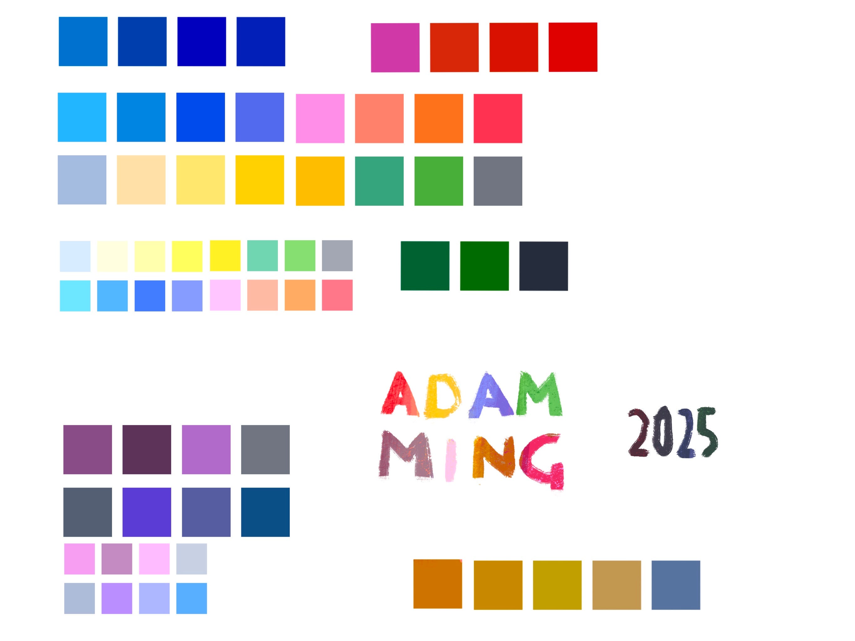
Get my 2025 Colour Palette
44 years of colour inspiration

Yesterday I sent in the final colours for the 10th book I illustrated.
To celebrate, I tidied the studio. I was holding a book published in 1980 and another published in 2020 in my hands and realised that while these books were wildly different, they had almost identical colour palettes.
Then I checked one of my inspiration boxes and noticed most of the books in this box shared the colour palette.
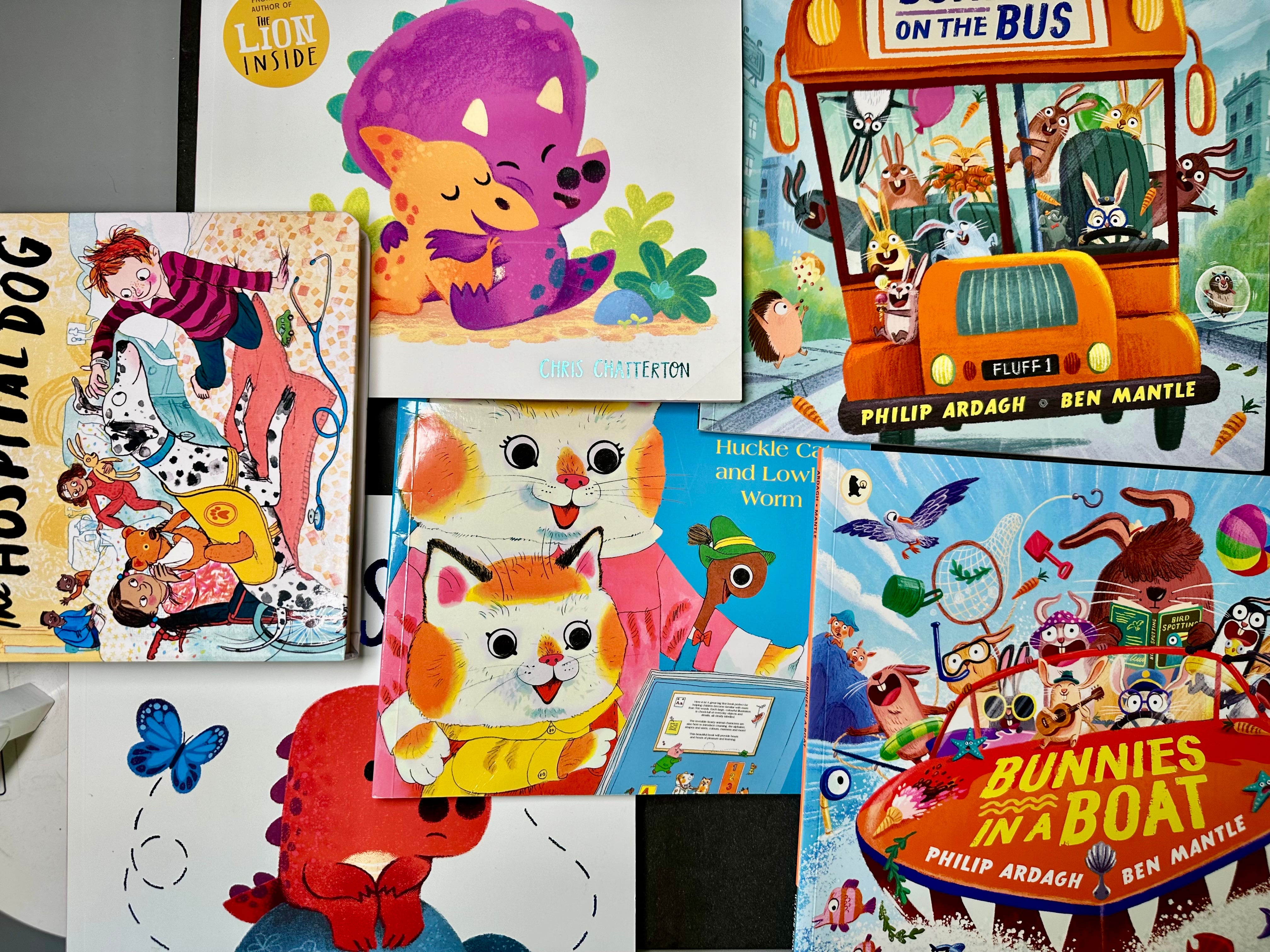
Every year since 2020 I’ve built a colour palette to serve as a go to starting point to my work. Noticing the similarities of the two books 40 years apart and everywhere between inspired next year’s colour palette.
You can Download the Colour-swatch for procreate green button below. Get it today because this post goes behind the paywall in 2 weeks.
I’ll be sifting through my 800 posts since 2020 for resources like this and organising them in one place. One place for all your illustration career growth. You can access this with an active subscription.
Including posts like:
📋 How to build a digital Colour Palette
It’s fun to pick from millions of potential colours, but that’s like picking 40 people from the street and trying to create a choir, you might get a gritty authentic sound, but it’s unlikely they will be able to sing together in some cohesive fashion.
There are relationships between colours and there are relationships between the printing process and colour choice this palette takes both of those relationships into account.
🔓Advance Your Illustration Career
If you would like to enjoy BONUS CONTENT including,
🗺️ My roadmap from illustration outsider to securing 10 five-figure picture book projects in 18 months.
🧠 Micro-Lessons on lots of useful topics to accelerate your illustration career.
🎥 20+ Hours of Video Workshops and Discussion.
💬 Vibrant Creative Community Connect with like-minded artists in our exclusive chat. Share experiences, seek advice, and grow together.
🏴☠️ Press the shiny, green button to unlock that secret treasure.