


Illustration Diary
21 OCT 2020
When I started thinking about drawing coffee.
I was immediately struck by the variety of flavours and forms that coffee comes in. I thought about what I wanted to express, and I was trying to think about my favourite cup of coffee.
I realised you could use the cup to describe the contents.
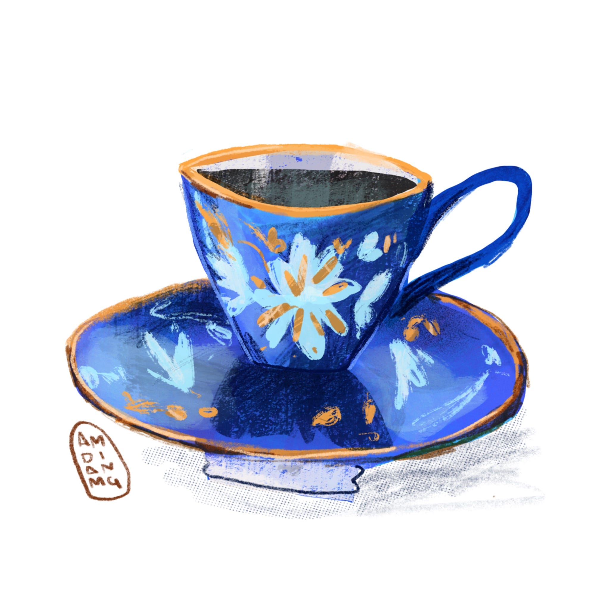
So I picked an expensive looking cup with gold accents and a floral motif. I think this best describes how I think of coffee, it’s a luxury and a treat, and best served in small potent doses.
👾 In the past I’ve had a preference for building up with muted colors, In this image I’m trying to build up with more saturated colors, muting them where Necessary I’m trying this new approach because I’m trying to avoid colors coming out looking too muddy in print.

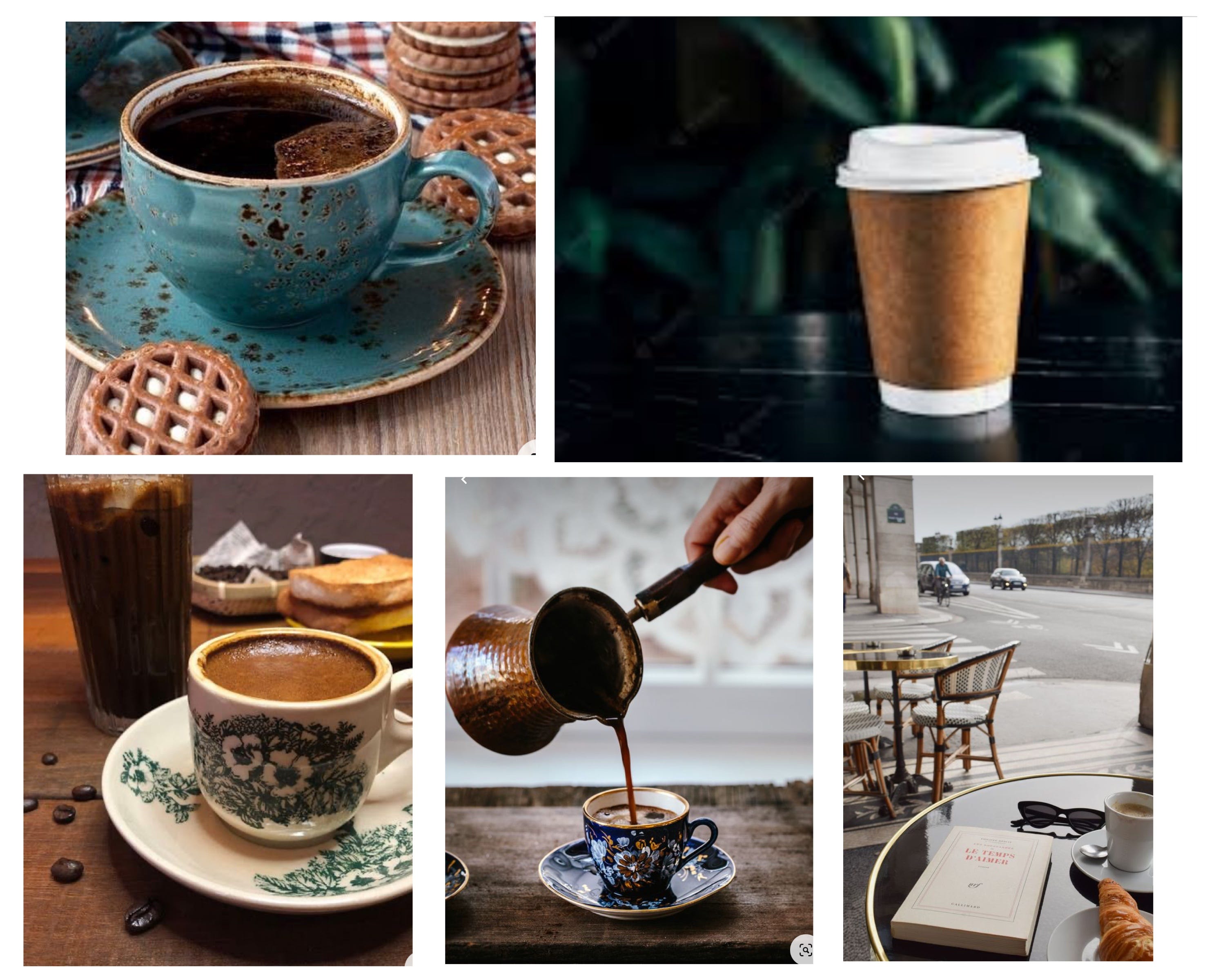
References
Here are the reference images of coffee cups I used in making this image:

Share this post